
The Cards…

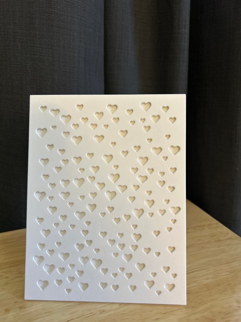
White-on-White, Popped for Dimension
The first card is all about light and shadow.
A white heart cover panel, popped up on a white card base, creates dimension without adding color or embellishment. The hearts become texture rather than theme, and the raised panel gives just enough depth to keep the design feeling intentional and finished.
This is often where I start when revisiting an older die. Before adding anything, I like to see what it does on its own.
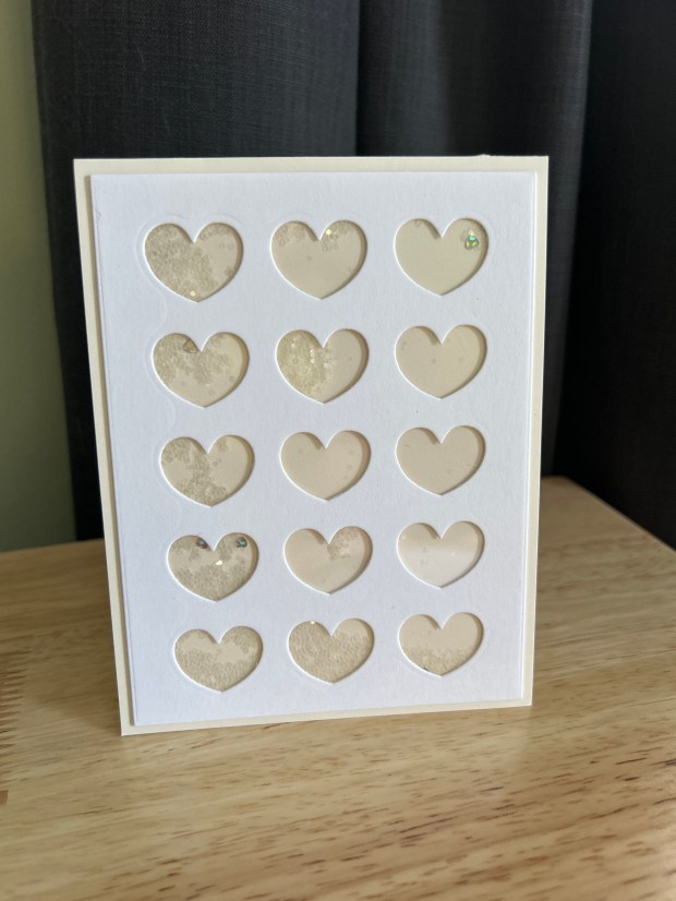
A Subtle Heart Flat Shaker
For the next card, I leaned into movement.
By backing a heart cover panel with acetate and adding a small amount of confetti, the design becomes interactive without becoming busy. Keeping the palette soft allows the shaker to feel like a surprise rather than the main event.
This reminded me that shaker cards don’t have to be loud to be joyful.
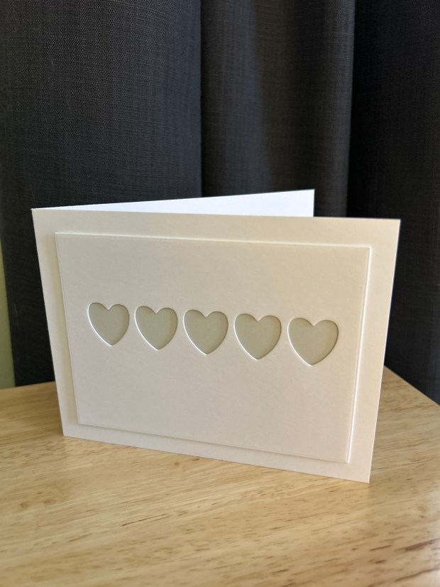
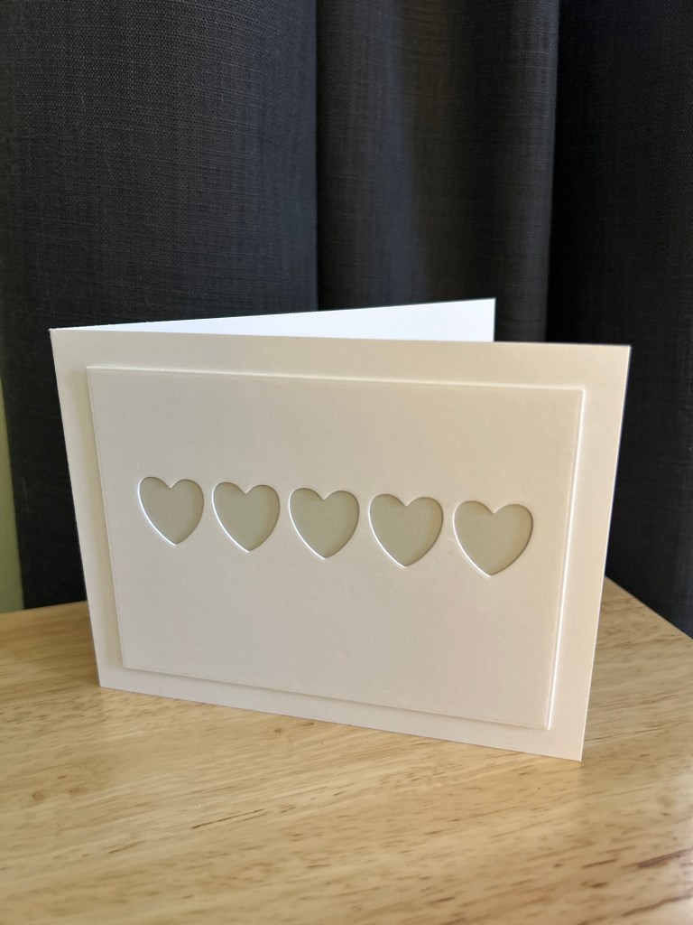
A Minimal Row of Hearts
This card using a row of hearts rather than a full panel.
A soft gray layer behind the hearts adds contrast while keeping the overall look calm and restrained.
This ended up being one of my favorites. It’s a reminder that you don’t always need to use an entire cover die to get a strong design.
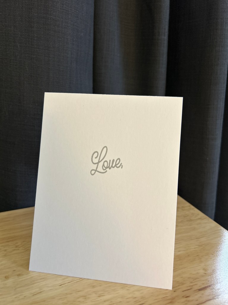
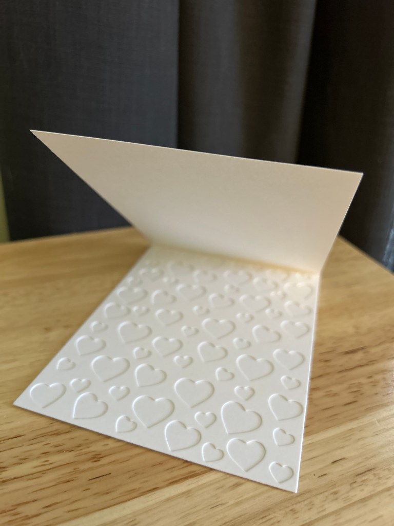
Turning the Card Inside Out
This card was the turning point for me.
Instead of using a heart cover die on the front of the card, I moved it to the inside and let the exterior stay almost completely bare. Just a single, softly stamped Love on the front, nothing else.
Opening the card becomes part of the experience. The texture and pattern are there, but they’re revealed quietly, only after you interact with the card. It changes the pacing. The outside is calm and restrained, while the inside carries the visual weight.
I love how this approach rethinks what a “feature” has to be. The cover die isn’t hidden, it’s simply waiting. And the card feels more intimate because of it, like something meant to be discovered rather than announced.
Final Thoughts
Even though these cards use four different heart cover dies, the process was the same for all of them: slow down, look closely, and let the supplies I already own guide the design.
Revisiting older tools like this helps me make more intentional choices and keeps my creative practice grounded in curiosity rather than accumulation. There’s often more range in a single category of supply than we remember.
If you have a cover die that hasn’t seen much use lately, this is your invitation to pull it out and see what else it might have to offer. My next step is to do something with all the hearts I have saved from cutting out these cover dies!
Supplies
- Assorted heart cover dies from my stash (including Hero Arts Heart Confetti Cover Die)
- Neenah Classic White (card bases and panels)
- Papertrey Ink Soft Stone Cardstock
- Clear acetate (for shaker cards)
- Confetti
- Foam adhesive strips from Amazon
- Gray ink (Catherine Pooler Pebble)
- Hero Arts Heart Confetti Cover Die
- Used for the inside-of-the-card reveal and white-on-white texture.
- Trinity Stamps Row of Hearts Dies
- Used for the minimalist linear heart designs on the front panels.
- Poppystamps Confetti Hearts Panel
- Smaller, scattered heart pattern for a soft white-on-white look.
- Simon Says Stamp Chunky Hearts Panel
