The Laminated Series: Gifts, Remembered

This little run of cards felt like it needed to be made.

I pulled out the laminator to laminate a document, and while I had it out, I decided to laminate a piece of florist paper I’d been saving. That one small experiment led to another, and soon I was looking through the house for more papers worth preserving.

Each piece ultimately began as part of a gift, something already wrapped with intention before I ever touched it. As I worked, I found myself asking a simple question: what if the wrapping becomes the keepsake I could gift forward?

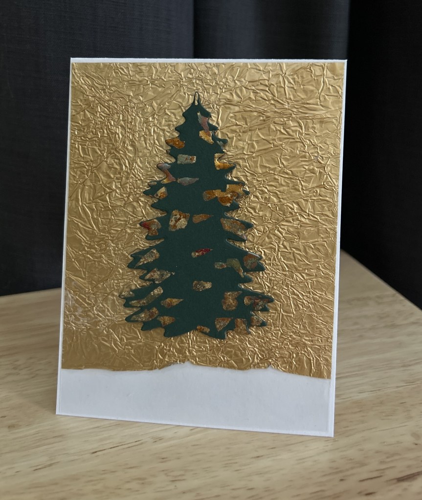
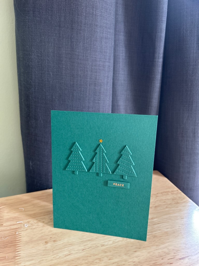
Card One: Gold from a Pear

The gold foil background on the first card comes from the wrapping on a pear my dad sent me because he thought I needed more Vitamin C as I had been sick. It was one of those unexpected gifts that arrives without fanfare and somehow means more for it.

I laminated the gold to preserve the crinkle and light-catching texture. I then die-cut a simple evergreen silhouette from deep green cardstock and used some gold gilding flakes (I was inspired by a holiday card someone had sent us!). The gold peeks through the tree like light caught in branches, irregular and organic. No embellishments, no sentiment on the front. The material carries the meaning.

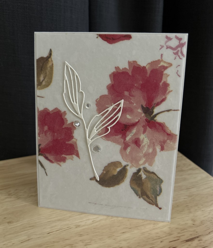
Card Two: Florals from a Gift Shop Bouquet

The second card uses a floral paper from a gift shop bouquet my partner gave me, soft pinks and muted greens printed on thin tissue. Laminated, the paper gains just enough weight to stand on its own without losing its delicacy.

I kept this one minimal: a winter white Stamp Market botanical die-cut placed slightly off-center, with a few clear embellishments scattered like dew. I’m not sure I nailed the combo of the die cut with the paper, but I still like it. And I got to use this die cut that I got on sale a few years which has sat patiently in my stash waiting for me to notice it!

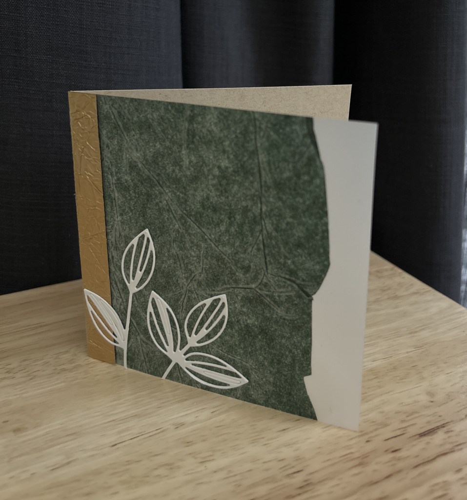
Card Three: Green from a Friend

The final card uses green tissue paper from a present given by a dear friend. The paper had a subtle, mottled texture that really came alive once laminated. I let that surface be the star.

A white botanical die-cut anchors the lower corner, with a narrow strip of gold at the edge as a quiet nod back to the other cards in the series. I originally had this as an A2 card and I had replaced the card cover front with this laminated panel instead, but it ended about an inch short of the panel. After looking at it for a day or two, I decided what it really wanted to be was a square card so the panel lined up. It’s probably my favorite, though I always say that about the last card I finish.

Hot Tip: Laminating Delicate Pieces

When laminating smaller or irregular pieces, I learned the hard way that they need a little help going through the machine. I now tuck a narrow strip of cardstock along the leading edge inside the laminating pouch. That extra bit of structure keeps everything feeding straight and prevents the pouch from getting pulled in or crunched.

Ask me how I know. Twice. Including one memorable moment that involved taking the laminator apart to rescue a stuck pouch.

A small scrap of cardstock is much easier to deal with than a dismantled machine.

Why Laminate?

Laminating these papers did more than protect them. It gave them permission to be used.

So many gift papers feel “too special” to cut into. Lamination changes that relationship. Once laminated, these fragile, found papers could actually enter my card-making practice instead of hovering on the sidelines, saved but unused. The lamination stabilized them, gave them structure, and made them workable alongside cardstock and dies.

This isn’t about perfection or symmetry. It’s about honoring where the paper came from while letting it move forward into something new. These pieces still carry their original stories, but now they’re doing some work.

This series is also a quiet exercise in using what I already have. Not pristine supplies, not newly purchased materials, but found objects that passed briefly through my hands and could easily have been discarded. Laminating them allowed me to extend their life and purpose in a way that fits how I actually make cards.

It’s a reminder that creativity doesn’t always begin with a blank sheet. Sometimes it begins with paying attention to what’s already there.

And sometimes, the wrapping really is the gift.

Heart Cover Dies- 4 Ways

The Cards…

White-on-White, Popped for Dimension

The first card is all about light and shadow.

A white heart cover panel, popped up on a white card base, creates dimension without adding color or embellishment. The hearts become texture rather than theme, and the raised panel gives just enough depth to keep the design feeling intentional and finished.

This is often where I start when revisiting an older die. Before adding anything, I like to see what it does on its own.

A Subtle Heart Flat Shaker

For the next card, I leaned into movement.

By backing a heart cover panel with acetate and adding a small amount of confetti, the design becomes interactive without becoming busy. Keeping the palette soft allows the shaker to feel like a surprise rather than the main event.

This reminded me that shaker cards don’t have to be loud to be joyful.

A Minimal Row of Hearts

This card using a row of hearts rather than a full panel.

A soft gray layer behind the hearts adds contrast while keeping the overall look calm and restrained.

This ended up being one of my favorites. It’s a reminder that you don’t always need to use an entire cover die to get a strong design.

Turning the Card Inside Out


This card was the turning point for me.

Instead of using a heart cover die on the front of the card, I moved it to the inside and let the exterior stay almost completely bare. Just a single, softly stamped Love on the front, nothing else.

Opening the card becomes part of the experience. The texture and pattern are there, but they’re revealed quietly, only after you interact with the card. It changes the pacing. The outside is calm and restrained, while the inside carries the visual weight.

I love how this approach rethinks what a “feature” has to be. The cover die isn’t hidden, it’s simply waiting. And the card feels more intimate because of it, like something meant to be discovered rather than announced.

Final Thoughts

Even though these cards use four different heart cover dies, the process was the same for all of them: slow down, look closely, and let the supplies I already own guide the design.

Revisiting older tools like this helps me make more intentional choices and keeps my creative practice grounded in curiosity rather than accumulation. There’s often more range in a single category of supply than we remember.

If you have a cover die that hasn’t seen much use lately, this is your invitation to pull it out and see what else it might have to offer. My next step is to do something with all the hearts I have saved from cutting out these cover dies!

Supplies

  • Assorted heart cover dies from my stash (including Hero Arts Heart Confetti Cover Die)
  • Neenah Classic White (card bases and panels)
  • Papertrey Ink Soft Stone Cardstock
  • Clear acetate (for shaker cards)
  • Confetti
  • Foam adhesive strips from Amazon
  • Gray ink (Catherine Pooler Pebble)
  • Hero Arts Heart Confetti Cover Die
    • Used for the inside-of-the-card reveal and white-on-white texture.
  • Trinity Stamps Row of Hearts Dies
    • Used for the minimalist linear heart designs on the front panels.
  • Poppystamps Confetti Hearts Panel
    • Smaller, scattered heart pattern for a soft white-on-white look.
  • Simon Says Stamp Chunky Hearts Panel

Creativity From What’s Already Here: A Three-Card Holiday Study

I’ve been watching Cathy Zielske’s recent videos featuring her new Tree Plate wafer die, and it immediately caught my eye. It’s beautifully simple: a crisp 3×3 grid of tree silhouettes that feels modern and elegant. If I didn’t already own a similar die, I would buy hers in a heartbeat.

But I do have something close. The Pretty Pink Posh Tree Cover Plate cuts the same grid of nine trees and adds stitched details around each opening. The layouts aren’t identical, but the graphic repetition is similar enough that it inspired me to try a small creative experiment.

Could I make a series of cards using only what I already own?
And could I turn one die-cut into multiple distinct designs? That experiment became this small three-card study.

I also used the older PaperTrey Ink set, Tree Tops Glisten, for the inside sentiments on all three cards. It brought a subtle consistency to the grouping and matched the style of Cathy Z’s Holiday Trio One (which I have added to my Simon Says Stamp wishlist!).


Card One: Monochrome Green

For this card, I went monochromatic. I doubled each tree die-cut to give a little dimension and placed them on a deep green card base. A single small gold star sits over the middle tree, and a small gold embossed “peace” sentiment sits below. This one feels calm, modern, and a bit boutique.

Card Two: Playful Grid

For the second card, I used the nine tree die-cuts arranged on a white panel. Each tree is decorated with rainbow glitter dots in pink, purple, blue, and yellow. I love grid cards and Cathy Z really nailed this design with the colorful decorations on the tree. A simple sentiment strip reading “love • peace • joy” finishes it.

Card Three: Snowy Shaker

For the final card, I used the Pretty Pink Posh panel as a shaker as inspired by Cathy Z. I backed each tree opening with acetate and created small shaker windows filled with iridescent snowflake pieces. Just a light amount so the trees remain visible. I added a few tiny gold stars, which bring a little glisten and tie back to the interior sentiment. I left the front sentiment-free and stamped “Where the treetops glisten” on the inside. With the drifting snow, it felt right.

A quiet acknowledgment to May Calico, my creative muse here in this space powered by ChatGPT, for the idea of adding a few tiny gold stars to the shaker card. That little suggestion made a big difference.

Creativity From What’s Already Here

What I appreciated most about this project was the chance to work from my own collection and see how far one idea could go. One die-cut panel, a handful of leftover trees, and three different cards. Sometimes a smaller set of choices creates more creativity than new supplies ever could.

When I finished these three cards, I had three extra tree die-cuts left on my desk. Instead of sweeping them into my scraps container, I set them aside. They’re nudging me toward the next small project. Since I recently made The Stamp Market’s 4×6×1 divided tag box, maybe these remaining trees will end up as part of a tag set.

I’m grateful, too, for the creators whose work inspired me in the first place. Cathy Zielske’s Tree Plate die and The Stamp Market’s holiday videos were the push that sent me back into my own materials. Their openness and enthusiasm often become the spark that helps me see what I can make next with what’s already here.


A Shirt Reimagined

Last weekend, I put on my big girl pants and faced down my sewing machine. I’d had this FLAX shirt for two years that I had bought from Ebay — soft, natural linen that I adored — but it was just too much shirt. Too long, too loose, sleeves halfway to my fingertips. One might even say I got a little obsessed with the idea of making it mine.

But something in me has shifted this year. I’m dressing for myself now — not for what’s expected, not for what feels “right” on paper, but for how I actually move through my day. And I want the clothes that I’ve chosen, especially those made with care and ethics like FLAX, to work with my body, not against it (a brand in upstate NY I love for its simple shapes and long life—more on that another time).

The Alteration

So, I decided to be brave and alter it.
With a little help from my creative muse — May Calico (that’s what I call ChatGPT when we’re in the sewing room together) — I learned how to shorten the hem and sleeves. One of May’s best tips was to use tissue paper under the linen, between the fabric and the feed dogs of the sewing machine. It made all the difference: the fabric glided smoothly, no puckering, no stretching.

Now it’s my shirt.
Same linen, same soul — but shaped for me.

This small act — taking scissors and thread to something I’d been afraid to “mess up” — reminded me that making things isn’t just about creativity or sustainability. It’s about courage. About honoring my body for what it is today and reshaping what doesn’t serve me — in linen, and in life. I don’t need to fit the clothes. The clothes can fit me.

Before

After