Finally playing with a set I admired back in 2016 from Papertrey Ink.
There is a particular joy in finally getting your hands on something you’ve wanted for years. When Papertrey Ink released Just Desserts by Lizzie Jones in March 2016, I remember admiring it instantly: the clean lines, the playful toppings, the thoughtful layering. At the time it was outside my budget, and it slipped into that familiar category of “maybe someday.”
This month I found the set secondhand from another PTI fan, and it felt like a little message from my 2016 self: you get to play with this now. And now that it’s mine nearly a decade later, I’m discovering how well it fits the way I create today. Minimal, intentional, with small touches of sparkle and a few new tools I didn’t have back then. It turned into a fun Just Desserts Series full of experimentation and joy.
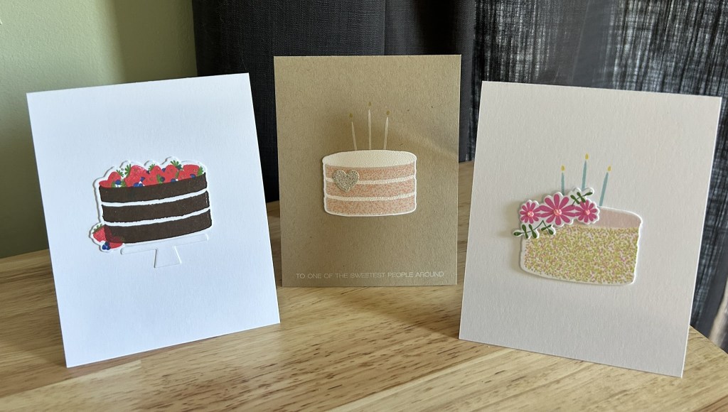
Here are the three cards in the order shown in the photo.
Card 1: Chocolate Berry Cake
This one is bold but still very clean. The chocolate layers add natural contrast, and the berries bring in color without making the card feel busy. I added a few soft sparkle dots with a Jelly Roll glitter pen, one of my favorite ways to finish a minimal card without overwhelming it.
The cake stand isn’t part of the Just Desserts set; I borrowed it from another Papertrey Ink set, I believe Imitation Basics. The scale isn’t perfect, but the embossed white-on-white look keeps it subtle, and it supports the design without drawing attention to itself.
Even with the deeper palette, the card stays minimal thanks to the open layout and calm spacing. It’s a nice reminder that bold color can still feel quiet and intentional.
Card 2: Kraft Cake With the Glitter Heart
This card became the heart of the series. I embossed the frosting with Brutus Monroe Alabaster Sparkle, which adds a fine shimmer that’s subtle but lovely in person. At first the cake felt a little ungrounded, and I tried adding a heart between the cake and the sentiment. That didn’t quite solve it.
The breakthrough came when I moved the heart onto the cake itself. Suddenly it felt intentional rather than corrective, and it became a focal point that tied everything together.
This one ended up modern, warm, and just a little bit sweet.
Card 3: Floral Sprinkle Cake
For this one, I wanted the stamped image itself to be the focal point. Lizzie’s three-layer sprinkle stamp is so well designed, and I used pink, soft green, and yellow inks to build those layers. The look is cheerful and light, and it doesn’t need much else. I added tiny drops of Stickles to the flower centers for a bit of sparkle. Each card in this series has some hint of shimmer, and here it feels especially playful.
What This Series Reminded Me Of
Working with this set that I admired years ago reminded me of a few things:
• Delayed gratification can be truly delightful.
• Minimal layouts let the designs shine.
• I don’t always need something new to feel inspired. Using what I have, or finding something secondhand, invites discovery.
• Older stamps don’t limit me. They give me room to explore.
• A touch of sparkle goes a long way.
This set was worth the wait.
