One of my favorite creative rituals isn’t starting something new.
It’s going back.
I give away almost all of the cards I make. I’m known for my kraft box of cards. When seasons change, like now as I put away Christmas and holiday cards, I go through what was left from the last cycle. They’re finished, technically, but no one picked them. And that tells me something important: the card isn’t bad, it’s just unresolved.
I pull those cards out and put them in a pile, saving them to revisit in a different light when I have a moment.
This card lived in that pile for a while.
The original problem
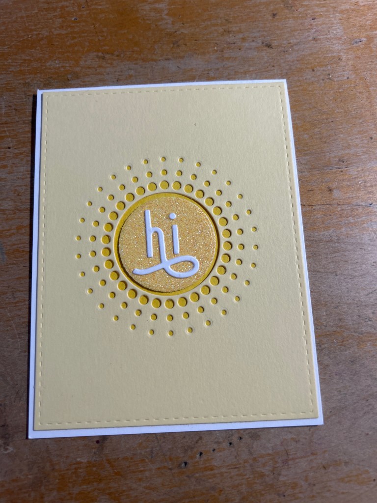
The original version had all the right ingredients:
- a cheerful yellow sunburst
- a simple “hi”
- a little sparkle
But everything was polite. Centered. Careful. The colors were pleasant, the design was tidy, and yet nothing invited the eye to linger. It was the kind of card you don’t dislike, but also don’t reach for.
And that’s usually the clue.
The first change: commitment
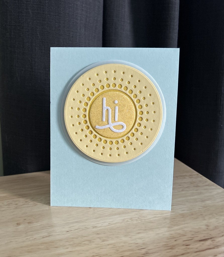
Instead of trying to tweak the card in place, I made a more decisive move and cut the entire focal element into a circle. Looking at it more critically, I realized the stitched panel was fighting with the fantastic sunburst die cut.
That single change gave the design a sense of confidence. Of course, it also meant die cutting through four layers of paper, which ultimately resulted in me carefully separating the top layers that did cut from the card base that very much did not.
But the result was worth it. The sunburst stopped behaving like a background detail and started acting like a focal point.
Sometimes a card doesn’t need more.
It needs a clearer decision.
The second change: contrast
Next, I mounted the circle on a soft blue card base. This was the turning point. I was very consciously channeling a sky.
The warm yellow finally had something to push against, and the sparkle in the center suddenly felt intentional instead of decorative. The card shifted from neutral to expressive simply by letting warm and cool colors do their natural work.
The final change: air
The finishing touch was a thin vellum shadow behind the circle, with two smaller circle die cuts layered underneath to create a little space between the vellum and the card base.
That quiet layer made all the difference. It added separation without weight, softness without distraction. No extra embellishments, no added noise. Just a little breathing room so the focal element could sit comfortably on the card front.
This was the moment the card felt finished.
A note about the inside
The original card had “brighter days ahead” stamped on the inside.
It wasn’t wrong, but it felt a bit like making a promise I couldn’t fully keep. I’ve realized I don’t love sentiments that tell someone else how to feel or what’s coming next. It’s the same reason I shy away from cards that say “smile.” I don’t want to instruct or predict on someone else’s behalf.
What I can do is offer something that’s within my control.
So I’m redoing the inside sentiment as “sending sunshine.” It’s more personal and more active, and it mirrors exactly what the front is doing visually. It’s not a directive or a forecast, just a small offering.
Sometimes the fix isn’t just structural.
Sometimes it’s tonal.
Why I love doing this
Redoing unchosen cards teaches me more than starting from scratch:
- I learn why something didn’t work
- I practice restraint instead of accumulation
- I use what I already have
It’s low-stakes, deeply satisfying, and surprisingly instructive. Often the card doesn’t need to be remade. It just needs to be listened to.
This one is finally ready to go back in circulation.
And the orphan pile just got a little smaller.
Supplies
- Die: Memory Box Circle Burst
- Sentiment: The Stamp Market “hi” word die (now discontinued)
- Center circle: Yellow glitter cardstock (brand unknown, from stash)
- Cardstock:
- Yellow cardstock for the burst (Papertrey Ink or similar weight)
- Soft blue card base (likely Spellbinders, exact color unknown)
- Vellum: Heavyweight vellum from stash
- Adhesives: Standard tape runner and liquid glue
