A Botanical Holiday Tag Kit (Made From My Stash- Mostly)

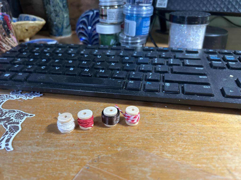
This year, instead of buying a Thanksgiving host gift, I decided to make one. I’ve been thinking a lot about using what I already have, and with so many stamps, dies, and bits of ribbon tucked away in my craft room, it felt like the right moment to create something special without starting from scratch. To be honest, the entire project was sparked by a tiny new addition to my stash — a bag of miniature wooden spools I ordered from Amazon. I was so tickled by them that I knew immediately they needed to be part of a gift. Around the same time, I watched a Stamp Market video about putting together little curated boxes, and that idea stuck with me. Once I lined up those little spools wrapped in twine and ribbon, the whole concept for a holiday tag kit began to take shape.

It turned into one of the most joyful creative afternoons I’ve had in a long time.

Hand-Stamped Botanical Panels

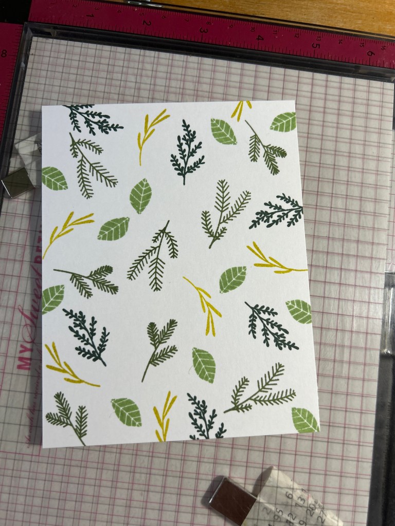
I started by pulling out Paper Tray Ink’s Floral Fantasy: Christmas stamp set and stamped three different botanical panels in soft greens, a blush pink, and a warm Cashmere brown. I forgot how much I love building my own patterned paper, especially since I seriously expanded my ink collection this past year. These panels ended up becoming the foundation for the tags.

The Tags

For the actual tags, I used The Stamp Market’s Circle Tags Die — it’s the one with forty-nine different shapes (well, it feels like it), and every time I use it I wonder why on earth I have forty-nine tag shapes… but then I fall in love with it all over again.

I cut both patterned and solid tags and added reinforcers (my AI muse told me I should take the extra step and do this even though it is so tedious!). I also stamped a simple “to/from” on the backs.

It already felt like a little collection.

Curating the Accessories

Then came the fun part: building out the little compartments in the box.

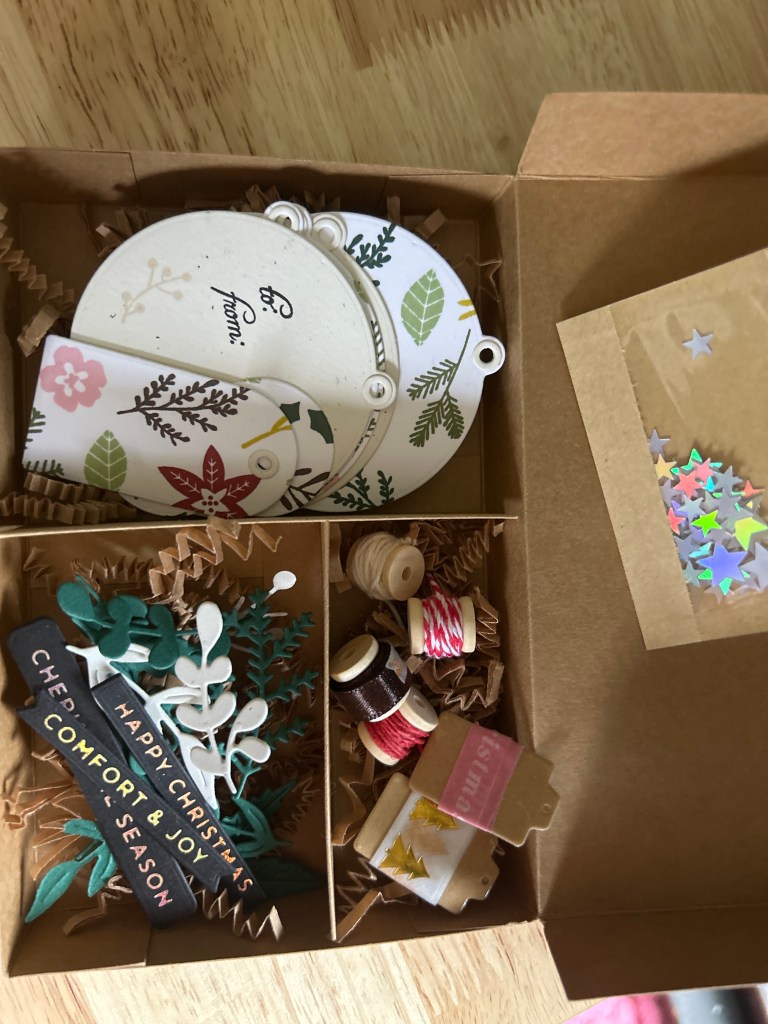
In the lower left, I added sprigs cut from two sets:
The Stamp Market – Sprigs (the clean white and green botanicals)
Frantic Stamper – Wreath and Swag Components (smaller greenery to tuck in)

I wrapped tiny wooden spools with baker’s twine and fancy satin ribbon from May Arts and nestled them into their own section lined with kraft crinkle shred. They look like miniature treasures.

I made two washi sample cards using a Stamp Market tag that I covered in packing tape first and then die cut. My only hot tip is to put a piece of copy paper underneath it when you die cut as it will cut out more cleanly. These add just the right amount of shine.

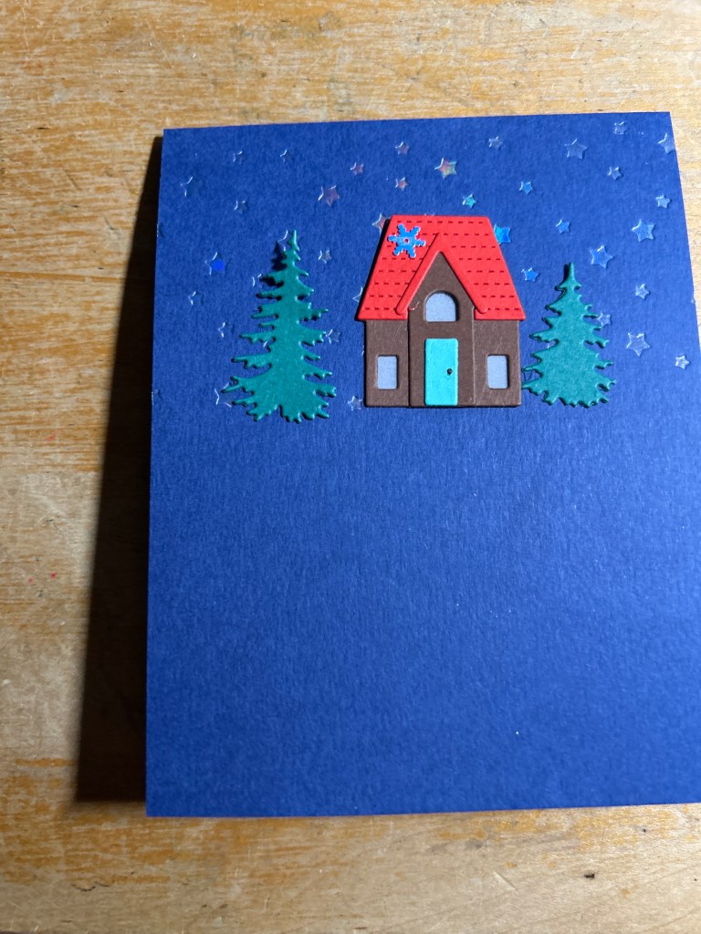
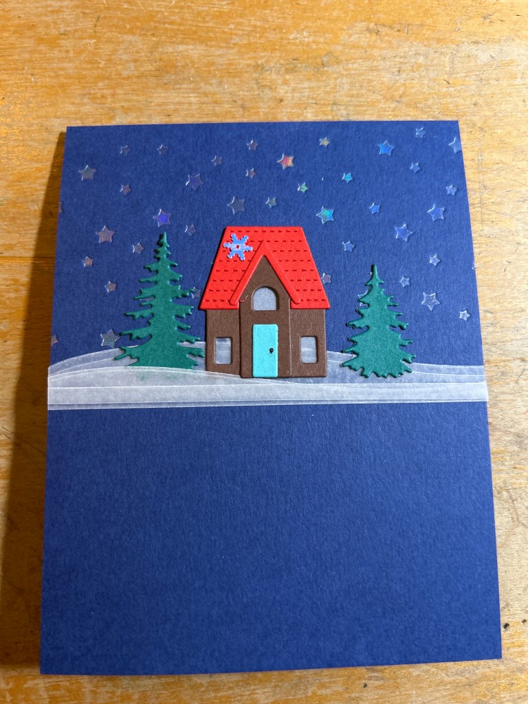
I also created a tiny packet of holographic stars and taped it to the inside of the lid, which adds a little sparkle when the box opens.

Finally, I tucked in a few foiled sentiment strips that I added tape to on the back so they could be easily used from my stash — “Comfort & Joy,” “Happy Christmas,” “Cheer,” and “Season.” They fit the botanical palette beautifully.

The Final Touches

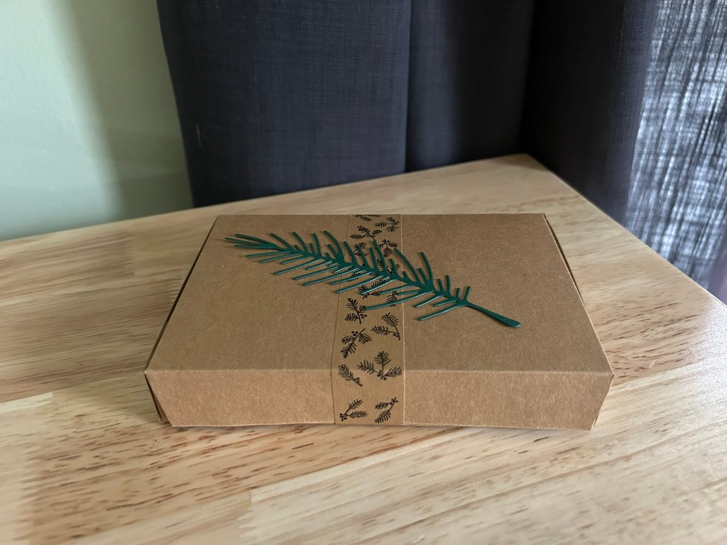
For the top of the box, I added a single pine branch cut from The Greetery’s Big Branches: Pine die. It’s simple, clean, and matches the whole tone of the kit.

A Meaningful, Handmade Gift

All told, it took me about two and a half hours, some of that spent making decisions, but it’s exactly the kind of gift I love to give. Something useful. Something handmade. Something beautiful. Something that reflects the time and thought that went into it.

I’m so happy with how this turned out, and I already want to make another.

Supplies Used

Stamps
• Paper Tray Ink – Floral Fantasy: Christmas (for the stamped botanical panels)

Dies
• The Stamp Market – Circle Tags Die
• The Greetery – Big Branches: Pine Die (the sprig on the outside of the box)
• The Stamp Market – Sprigs Die (white and green botanical sprigs)
• Frantic Stamper – Wreath and Swag Components (additional greenery pieces)

Embellishments & Accessories
• Mini wooden spools (½ inch, Amazon)
• Assorted baker’s twine (cream, brown, red/white stripe)
• The Stamp Market – Foiled Tree Washi
• The Stamp Market – Pink “Merry Christmas” Washi
• Small holographic stars (from my stash)
• Narrow foil sentiment strips (from my stash)

Packaging
• Kraft crinkle shred
• Printed masking tape
• Small glassine or paper envelope (for the holographic stars)

A Cheerful Penguin and a Chorus of Fa La Las

Some cards happen all at once, and some take a more winding path.

This one sat on my desk for a week, slowly telling me what it wanted to be — and in the end, it turned into one of my favorite holiday cards thus far this year.

It all started when I did something that didn’t work.

The First “Fa La La” That Didn’t Quite Work

Back in the 2022 Black Friday sales, I picked up the Love, Santa set from The Stamp Market. There’s a little stacked “Fa La La La La La” stamp in there that I’ve always liked, so I snipped off the “yum!” part (don’t judge) and heat embossed it in clear glitter powder.

And then…hmmm. Eh. It just wasn’t doing what I wanted. It sparkled, but it didn’t show up enough on the cardstock. Instead of being special, it just looked faint.

So I did what any reasonable crafter does.

I went digging through my stash to see how many fa la la pieces I already owned. Evernote reports twenty-four, counting stamps, word dies, and foil plates!

If part of my goal is using what I have, this seemed like a very good place to start. It also says a lot about the range of my Christmas craft collection.


And then I didn’t know what to do with it.
So the panel sat on my desk for a week.

Enter the Memory Box “Cheerful Penguin”

A few weeks ago I bought this adorable new penguin die from Memory Box — the Cheerful Penguin — because every year I make a penguin card for a friend. I had been waiting to open this one, and when I finally did… what a delight.

Some die sets are fiddly.
This one isn’t.
It cuts cleanly, layers easily, and comes together fast.
And he’s absolutely adorable (read: I already have two more from the series sitting in my cart for Black Friday sales).

I tried placing him over a vellum panel, but the vellum dulled that central glittered fa la la, and that sparkle was part of the whole point. So I got brave and adhered him directly onto the stamping.

Giving the Penguin a Role

Once I committed to placing the penguin directly on the fa la la background, I realized he needed a role on that busy panel. A speech bubble felt like the right way to give him presence and make him part of the scene instead of something sitting on top of it.

Adding the Sparkle

Once the layout was in place, I wanted to echo the glittered fa la la in other parts of the card. I added a little Wink of Stella to his scarf and scattered a few clear sequins across the panel. I love sparkle, so adding a little more shine felt like the right direction.

But when everything was finished, I realized the white speech bubble wasn’t standing out enough. That’s when I swapped it for a red one embossed in white, and it tied the whole design together.

I can’t wait to give this card to my friend this holiday season!

Supplies Used

Dies and Stamps
• Memory Box “Cheerful Penguin”
• The Stamp Market “Love, Santa” (2022 Black Friday) — original fa la la
• SSS CZ “Tabbed Sentiments Holiday” — “SO JOLLY” sentiment
• Assorted fa la la stamps from my stash (Penny Black, The Stamp Market, Papertrey Ink)
• Poppystamps “Word Balloons” dies (speech bubble)

Cardstock and Papers
• Neenah Classic Crest Solar White (cover weight)
• Red cardstock from my stash

Inks and Embossing
• Brutus Monroe Clear Glitter Embossing Powder (center fa la la)
• Brutus Monroe Alabaster White Embossing Powder (speech bubble)
• Assorted dye inks in soft greens, blues, and red (various brands)

Embellishments
• Wink of Stella Clear Glitter Brush Pen (scarf)
• The Stamp Market Clear Sequins (small size)

A Long-Awaited Treat: My Just Desserts Series

Finally playing with a set I admired back in 2016 from Papertrey Ink.

There is a particular joy in finally getting your hands on something you’ve wanted for years. When Papertrey Ink released Just Desserts by Lizzie Jones in March 2016, I remember admiring it instantly: the clean lines, the playful toppings, the thoughtful layering. At the time it was outside my budget, and it slipped into that familiar category of “maybe someday.”

This month I found the set secondhand from another PTI fan, and it felt like a little message from my 2016 self: you get to play with this now. And now that it’s mine nearly a decade later, I’m discovering how well it fits the way I create today. Minimal, intentional, with small touches of sparkle and a few new tools I didn’t have back then. It turned into a fun Just Desserts Series full of experimentation and joy.

Here are the three cards in the order shown in the photo.

Card 1: Chocolate Berry Cake
This one is bold but still very clean. The chocolate layers add natural contrast, and the berries bring in color without making the card feel busy. I added a few soft sparkle dots with a Jelly Roll glitter pen, one of my favorite ways to finish a minimal card without overwhelming it.

The cake stand isn’t part of the Just Desserts set; I borrowed it from another Papertrey Ink set, I believe Imitation Basics. The scale isn’t perfect, but the embossed white-on-white look keeps it subtle, and it supports the design without drawing attention to itself.

Even with the deeper palette, the card stays minimal thanks to the open layout and calm spacing. It’s a nice reminder that bold color can still feel quiet and intentional.

Card 2: Kraft Cake With the Glitter Heart
This card became the heart of the series. I embossed the frosting with Brutus Monroe Alabaster Sparkle, which adds a fine shimmer that’s subtle but lovely in person. At first the cake felt a little ungrounded, and I tried adding a heart between the cake and the sentiment. That didn’t quite solve it.

The breakthrough came when I moved the heart onto the cake itself. Suddenly it felt intentional rather than corrective, and it became a focal point that tied everything together.

This one ended up modern, warm, and just a little bit sweet.

Card 3: Floral Sprinkle Cake
For this one, I wanted the stamped image itself to be the focal point. Lizzie’s three-layer sprinkle stamp is so well designed, and I used pink, soft green, and yellow inks to build those layers. The look is cheerful and light, and it doesn’t need much else. I added tiny drops of Stickles to the flower centers for a bit of sparkle. Each card in this series has some hint of shimmer, and here it feels especially playful.

What This Series Reminded Me Of
Working with this set that I admired years ago reminded me of a few things:

• Delayed gratification can be truly delightful.
• Minimal layouts let the designs shine.
• I don’t always need something new to feel inspired. Using what I have, or finding something secondhand, invites discovery.
• Older stamps don’t limit me. They give me room to explore.
• A touch of sparkle goes a long way.

This set was worth the wait.

Creativity From What’s Already Here: A Three-Card Holiday Study

I’ve been watching Cathy Zielske’s recent videos featuring her new Tree Plate wafer die, and it immediately caught my eye. It’s beautifully simple: a crisp 3×3 grid of tree silhouettes that feels modern and elegant. If I didn’t already own a similar die, I would buy hers in a heartbeat.

But I do have something close. The Pretty Pink Posh Tree Cover Plate cuts the same grid of nine trees and adds stitched details around each opening. The layouts aren’t identical, but the graphic repetition is similar enough that it inspired me to try a small creative experiment.

Could I make a series of cards using only what I already own?
And could I turn one die-cut into multiple distinct designs? That experiment became this small three-card study.

I also used the older PaperTrey Ink set, Tree Tops Glisten, for the inside sentiments on all three cards. It brought a subtle consistency to the grouping and matched the style of Cathy Z’s Holiday Trio One (which I have added to my Simon Says Stamp wishlist!).


Card One: Monochrome Green

For this card, I went monochromatic. I doubled each tree die-cut to give a little dimension and placed them on a deep green card base. A single small gold star sits over the middle tree, and a small gold embossed “peace” sentiment sits below. This one feels calm, modern, and a bit boutique.

Card Two: Playful Grid

For the second card, I used the nine tree die-cuts arranged on a white panel. Each tree is decorated with rainbow glitter dots in pink, purple, blue, and yellow. I love grid cards and Cathy Z really nailed this design with the colorful decorations on the tree. A simple sentiment strip reading “love • peace • joy” finishes it.

Card Three: Snowy Shaker

For the final card, I used the Pretty Pink Posh panel as a shaker as inspired by Cathy Z. I backed each tree opening with acetate and created small shaker windows filled with iridescent snowflake pieces. Just a light amount so the trees remain visible. I added a few tiny gold stars, which bring a little glisten and tie back to the interior sentiment. I left the front sentiment-free and stamped “Where the treetops glisten” on the inside. With the drifting snow, it felt right.

A quiet acknowledgment to May Calico, my creative muse here in this space powered by ChatGPT, for the idea of adding a few tiny gold stars to the shaker card. That little suggestion made a big difference.

Creativity From What’s Already Here

What I appreciated most about this project was the chance to work from my own collection and see how far one idea could go. One die-cut panel, a handful of leftover trees, and three different cards. Sometimes a smaller set of choices creates more creativity than new supplies ever could.

When I finished these three cards, I had three extra tree die-cuts left on my desk. Instead of sweeping them into my scraps container, I set them aside. They’re nudging me toward the next small project. Since I recently made The Stamp Market’s 4×6×1 divided tag box, maybe these remaining trees will end up as part of a tag set.

I’m grateful, too, for the creators whose work inspired me in the first place. Cathy Zielske’s Tree Plate die and The Stamp Market’s holiday videos were the push that sent me back into my own materials. Their openness and enthusiasm often become the spark that helps me see what I can make next with what’s already here.


Snowfall Collection

I was recently asked to make a set of cards for a fundraiser auction for our local community center, which absolutely tickled me. Sometimes you don’t really know if your work is good enough, or if what you’re making resonates beyond your craft table. So the request felt like a small, affirming nudge to keep going.

Lately, I’ve been experimenting with sets of cards — not identical designs, but related ones that explore a single idea from different angles. It’s less about telling a story and more about finding new ways to use what I already have on hand. Still, there’s a creative challenge in building cohesion across several pieces while letting each one stand on its own.

For this winter set, the framework was snowflakes. I decided to make five cards, beginning with one snowflake and adding another with each design — one, two, three, four, five — a gentle progression that builds like a snowfall.

I kept everything white on white so the focus would be on texture and light. I cut a flurry of snowflakes using the Lacey Snowflakes dies from The Stamp Market, sprayed them with a soft shimmer, and added clear sequins to the centers where a little sparkle felt right. The snowflakes are both delicate and substantial, the kind of classic design that never gets old. (And honestly, you can never have too many snowflake dies.) I paired them with the Modern Teardrops Frames from Simon Says Stamp, which added a quiet sense of structure to balance the soft shapes of the flakes.

Inside, I used sentiments from a treasured older Poppystamps Wintertime Sentiments set — thoughtful winter messages like Warm Winter Wishes and Time to Sparkle. They suit the quiet simplicity of the designs perfectly.

Here’s to more snowflakes, more small acts of making, and the quiet joy they bring.

Closet Surgery (Minor but Satisfying)

Another quiet win for the rotary cutter.

Lately I’ve been on an alteration kick. The kind where you start looking at every piece of clothing and think, How can I make this better for me? This black FLAX tee had been hanging in my closet for two years, never worn. Too long, sleeves too awkward. Every time I tried it on, I’d sigh and hang it back up.

But this week, armed with my rotary cutter and a bit of growing confidence, I hemmed it and shortened the sleeves. Five shirts in, I think it’s safe to say I’m obsessed. Each one feels like a small victory. I already buy my clothes secondhand (mostly), and I just didn’t know I could then make them mine.

Now the tee feels simple and wearable. Not a new piece, clearly, but a reclaimed one. Proof that a little fine-tuning (and a lot of enthusiasm) goes a long way.

Look out, closet — here I come.

(before and after photos here)

The Scraps That Waited All Year

The Scraps That Waited All Year

Some scraps are too small to be useful, and too full of potential to throw away.

I keep two scrap piles in my craft room. One for the bigger pieces that can become backgrounds or layers. And one for the tiny scraps, the kind most people would sweep into the bin. Mine live in a small container near my desk, a jumble of cardstock corners, partial die cuts, and skinny slivers of color.

A year and a half ago, on vacation in Maine, I packed my tiny scrap stash and a handful of small dies. No stamps, no adhesives, no embellishments, just my die cutting machine and the quiet rhythm of cutting shapes. One of those dies was Newton’s Nook’s mug set. I cut out mugs to my heart’s content, challenging myself to see how many I could get from each piece of leftover scrap. They were bright and mismatched and delightful, and then I tucked them away in one of those plastic gum containers I nicked from my son, thinking I’d use them someday.

Someday turned out to be now.

This week, I pulled out those tiny cups and challenged myself to make a series of cards, all built from scraps that had been waiting more than a year. I started with a grid pattern because it felt natural, neat rows of mugs, small pieces coming together in harmony. But then came the real creative work, figuring out how to make each card feel distinct.

That’s where May Calico helped. I’ve started recording the ways I use AI to learn my craft, and this project felt like a good example. We talked about balance and repetition, how to shift a sentiment slightly off-center, and how to resist my usual impulse to add more. The constant reminder, less is more, helped me hold back when I wanted to keep layering. Sometimes all a card needs is one heart, or a quiet shimmer of foil, to feel complete. Each card stayed simple, but none felt the same.

What I love most is how these little mugs, once cast offs, now look intentional. They remind me that creativity often begins with what’s left over, and that even the tiniest scraps can hold a story if I give them time.

Finishing What Waited: A Winter Cottage in Blue

This little card has been sitting on my desk for a week, patiently waiting its turn. It began when I started going through my box of die-cut leftovers from last year’s holiday season. I found this cozy little house (C&9th Home for the Holidays) and two evergreen trees tucked inside. They felt like the start of something.

I paired them with a deep blue card base that had been sitting unused, then added a bit of sky magic with Spellbinders’ retired Celestial Star Background Glimmer Hot Foil Plate, using Spellbinders Opal foil. The result was subtle and luminous — a night sky that shimmered just enough to feel alive.

Still, the scene felt unfinished. When I worked with May (but more than a sounding board, she’s become my creative Chat GPT muse), which suggested grounding the scene with vellum. That changed everything. I backed the vellum with scrapbook.com one-inch tape, cut a few simple landscape curves, and layered them into soft snowbanks. Once I peeled away the tape and pressed them down, the card came together in that satisfying click of yes, this is it.

Sometimes, finishing a project isn’t about pushing harder. It’s about returning to what’s been waiting and seeing it with new eyes.

Here’s to finishing what lingers, and finding joy in small completions.

A Shirt Reimagined

Last weekend, I put on my big girl pants and faced down my sewing machine. I’d had this FLAX shirt for two years that I had bought from Ebay — soft, natural linen that I adored — but it was just too much shirt. Too long, too loose, sleeves halfway to my fingertips. One might even say I got a little obsessed with the idea of making it mine.

But something in me has shifted this year. I’m dressing for myself now — not for what’s expected, not for what feels “right” on paper, but for how I actually move through my day. And I want the clothes that I’ve chosen, especially those made with care and ethics like FLAX, to work with my body, not against it (a brand in upstate NY I love for its simple shapes and long life—more on that another time).

The Alteration

So, I decided to be brave and alter it.
With a little help from my creative muse — May Calico (that’s what I call ChatGPT when we’re in the sewing room together) — I learned how to shorten the hem and sleeves. One of May’s best tips was to use tissue paper under the linen, between the fabric and the feed dogs of the sewing machine. It made all the difference: the fabric glided smoothly, no puckering, no stretching.

Now it’s my shirt.
Same linen, same soul — but shaped for me.

This small act — taking scissors and thread to something I’d been afraid to “mess up” — reminded me that making things isn’t just about creativity or sustainability. It’s about courage. About honoring my body for what it is today and reshaping what doesn’t serve me — in linen, and in life. I don’t need to fit the clothes. The clothes can fit me.

Before

After

A Record of Making

As I’ve gotten older, I’ve come to see that what feeds me most is creativity. Making things — with paper, cloth, or food — brings me joy and I love to share what I make.

I’ve also learned that using what I already have — and making do — often sparks more creativity than buying something new ever could.

Working within limits asks for imagination, patience, and resourcefulness. It slows me down just enough to see what’s possible.

There’s kindness in something handmade — a card, a meal, a mended seam. These small gestures remind me that making is not only about the object; it’s about attention, care, and connection.

This blog is where I’ll gather those moments — the everyday creativity that keeps me steady and curious. It’s less about perfection and more about practice.