One of my favorite things about cardmaking is discovering that a project has been patiently waiting for me all along.
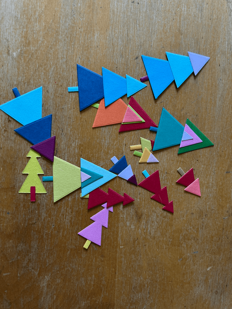
These colorful Christmas trees from My Favorite Things’ Cool Christmas Trees have had quite a journey. I cut all of the individual pieces two years ago, assembled the trees about a month ago, and then…they waited some more. They spent the next few weeks tucked inside one of my son’s empty plastic gum containers, which he generously donates to my craft room for storing little piles of die cuts. Eventually, inspiration caught up with them.
Rather than making five versions of the same card, I challenged myself to explore one idea from different angles. My theme became geometry. Each design pairs the same simple tree shapes with a different geometric element, creating a cohesive series while allowing every card to have its own personality.
Card One: Circles
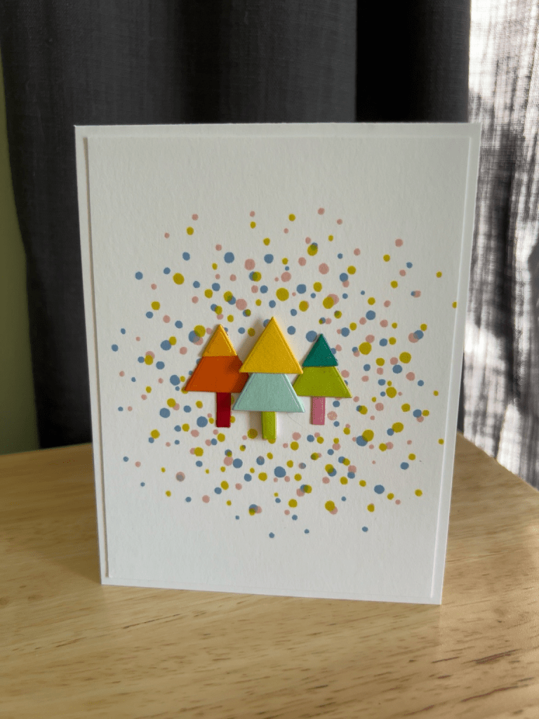
A cloud of colorful dots using Concord & 9th’s Bitty Burst creates the background for a tiny grove of trees. The circles almost become abstract ornaments or falling confetti, surrounding the trees without overwhelming them. It’s playful and energetic, yet the white space keeps everything feeling light.
Card Two: Bands of Color
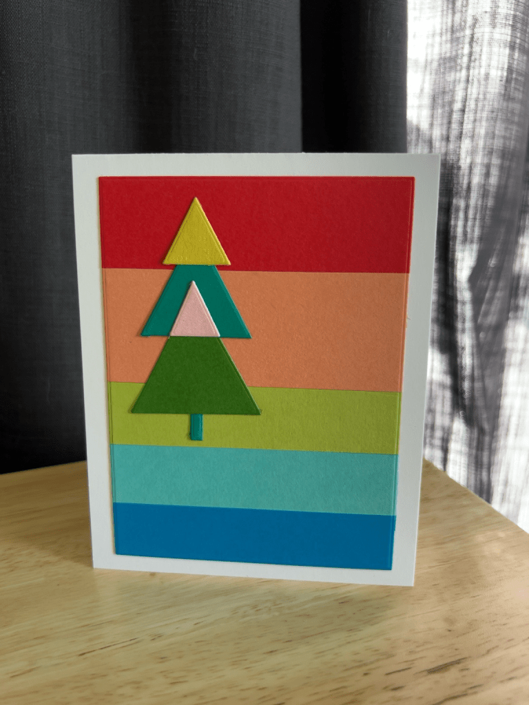
This may have surprised me the most. Wide horizontal strips of cardstock became the background, allowing the tree itself to echo the same bright palette. I worried it might be too much color, but by keeping the tree simple and leaving a generous white border, the design still feels balanced.
Card Three: Soft Curves
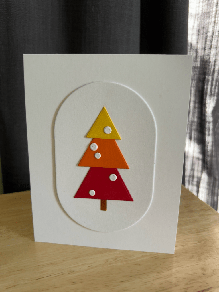
After all of the strong triangles, I wanted to introduce a contrasting shape. An arched panel frames a single tree decorated with tiny white ornaments. The curved outline softens the geometry without competing with it, giving this card a quieter, more modern feel.
Card Four: A Grid of Rectangles
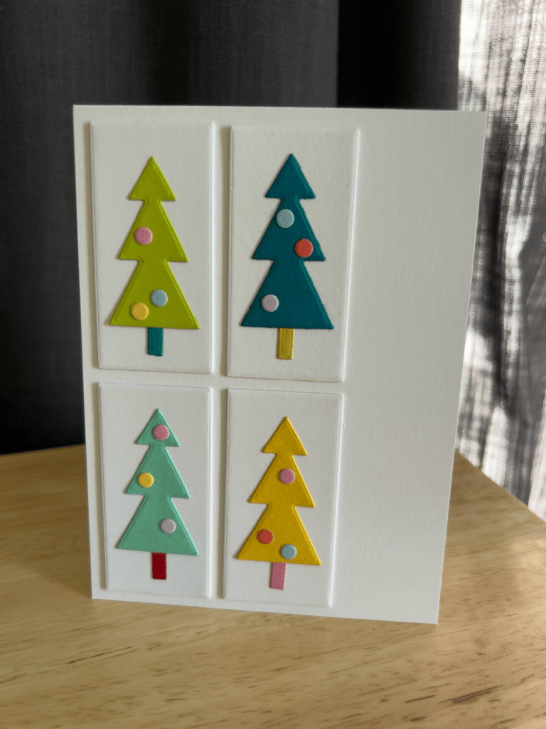
My first instinct was to use patterned paper for the rectangles, but the series really wanted to stay clean and architectural. Instead, I used simple white rectangles arranged in a grid, each highlighting a different tree. Adding a few colorful “ornaments” tied this card back to the first design while keeping the focus on shape and repetition.
Card Five: The Hexagon
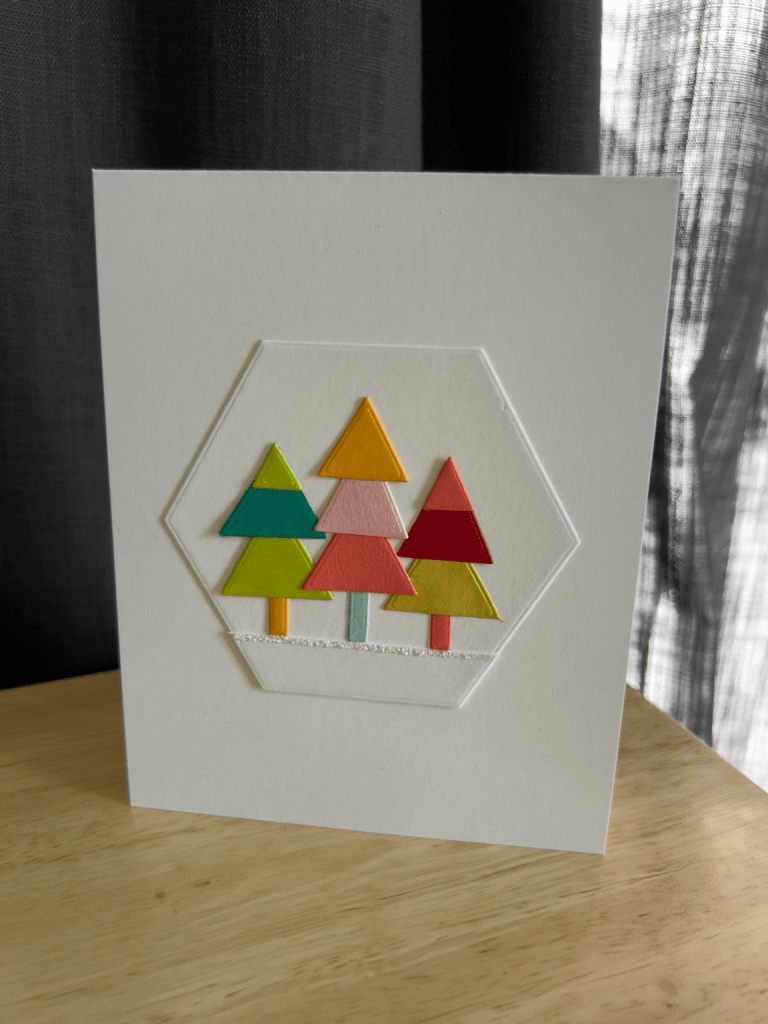
This one ended up becoming my favorite.
A simple white hexagon frames three overlapping trees, and a thin line of glitter Stickles beneath them becomes just enough snowy ground to anchor the scene. It feels crisp, modern, and quietly festive. Sometimes the smallest addition makes the biggest difference.
One lesson from this project really stayed with me.
None of these cards required a new stamp set or die. They came from pieces I’d already cut, scraps I’d already saved, and supplies that had been sitting on my desk waiting for a fresh idea.
Sometimes creativity isn’t about buying something new.
Sometimes it’s about looking at what you already have and asking, “What else could these pieces become?”
Happy crafting! 🎄