My Obsession with Candles

One Die Set, Four Very Different Birthday Cards

This week I pulled out the Concord & 9th Make-A-Wish die set and challenged myself to see how many different directions I could take a single candle die.

One of my favorite things about papercrafting is discovering just how versatile a well-designed product can be. Sometimes a set looks simple at first glance, but the more you play with it, the more possibilities begin to emerge.
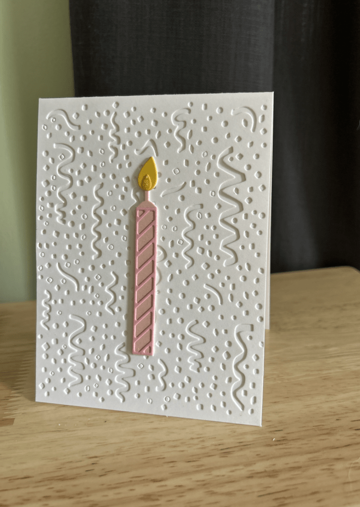
For my first card, I embraced a playful birthday-party feel with a white embossed confetti background and a single pink candle popped up for dimension. The texture did all the heavy lifting while the candle remained the star of the show.
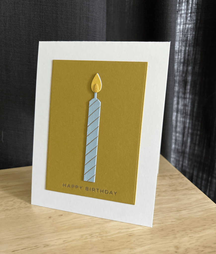
Next, I experimented with a much more minimal design using Papertrey Ink Saffron Spice cardstock paired with a soft blue candle. A foiled sentiment and a touch of Stickles on the flame were enough to create a clean, modern birthday card with a completely different personality.
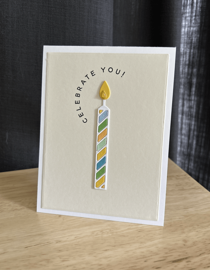
My favorite card of the group may be the simplest. A single colorful candle sits on a cream panel beneath an arched “Celebrate You!” sentiment. The design relies on negative space and a few carefully chosen details. Sometimes one candle really is enough.
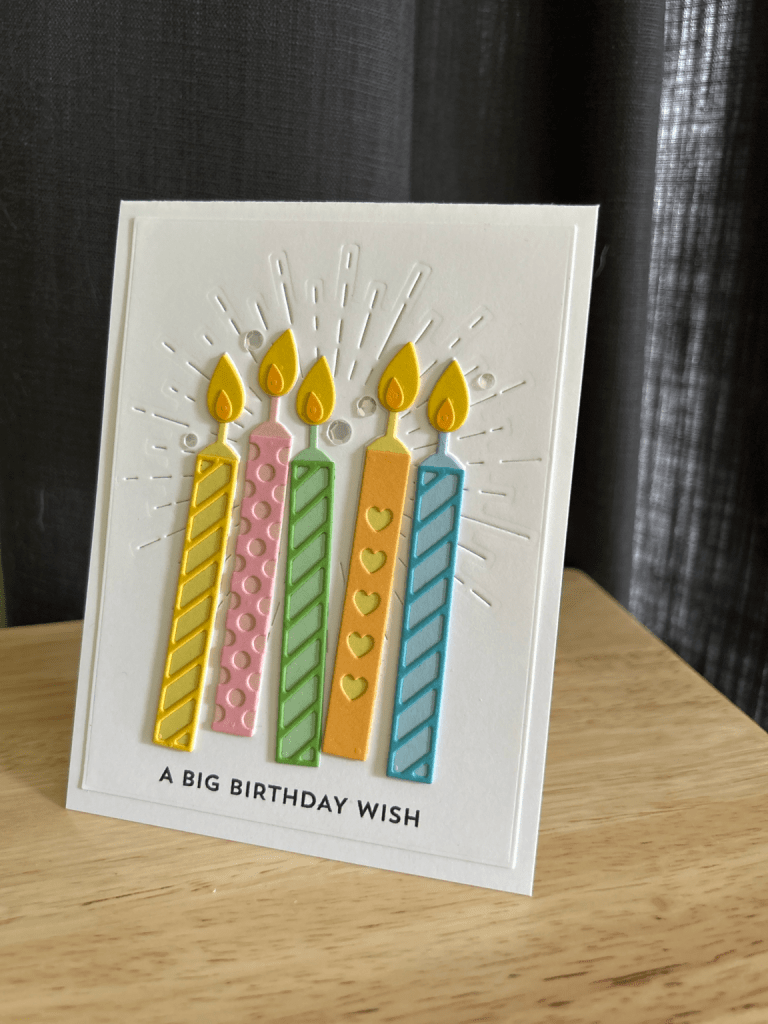
Finally, I created a more energetic card featuring a cluster of candles against a stitched burst background. Different colors and patterns gave each candle its own personality while still working together as a cohesive design.

I enjoyed this set so much that I tracked down the coordinating stamp set. After discovering there was only one left available at Scrapbook.com, I quickly added it to my cart. I’m looking forward to seeing what new possibilities the stamps bring once they arrive.
Casing a Watercolor Birthday Card (and Making It Your Own)

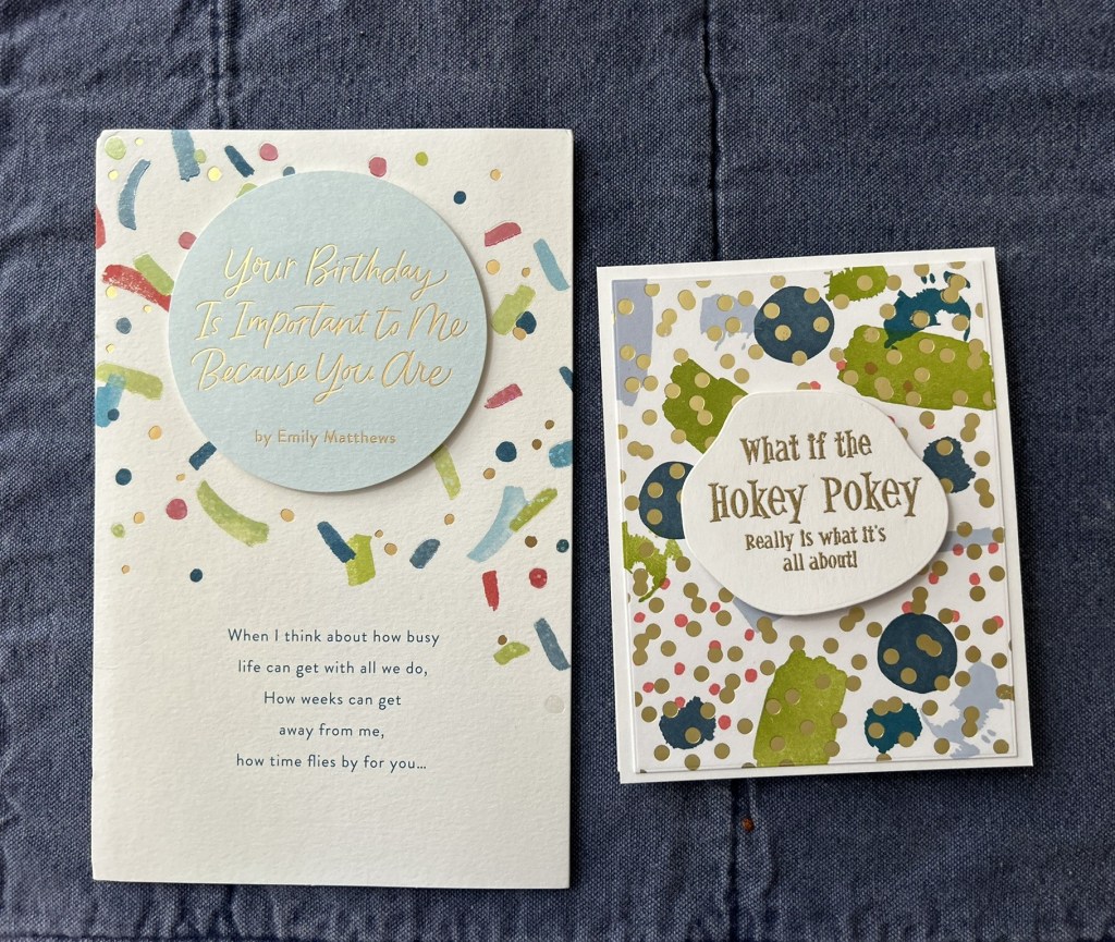
Sometimes inspiration arrives in the mail.

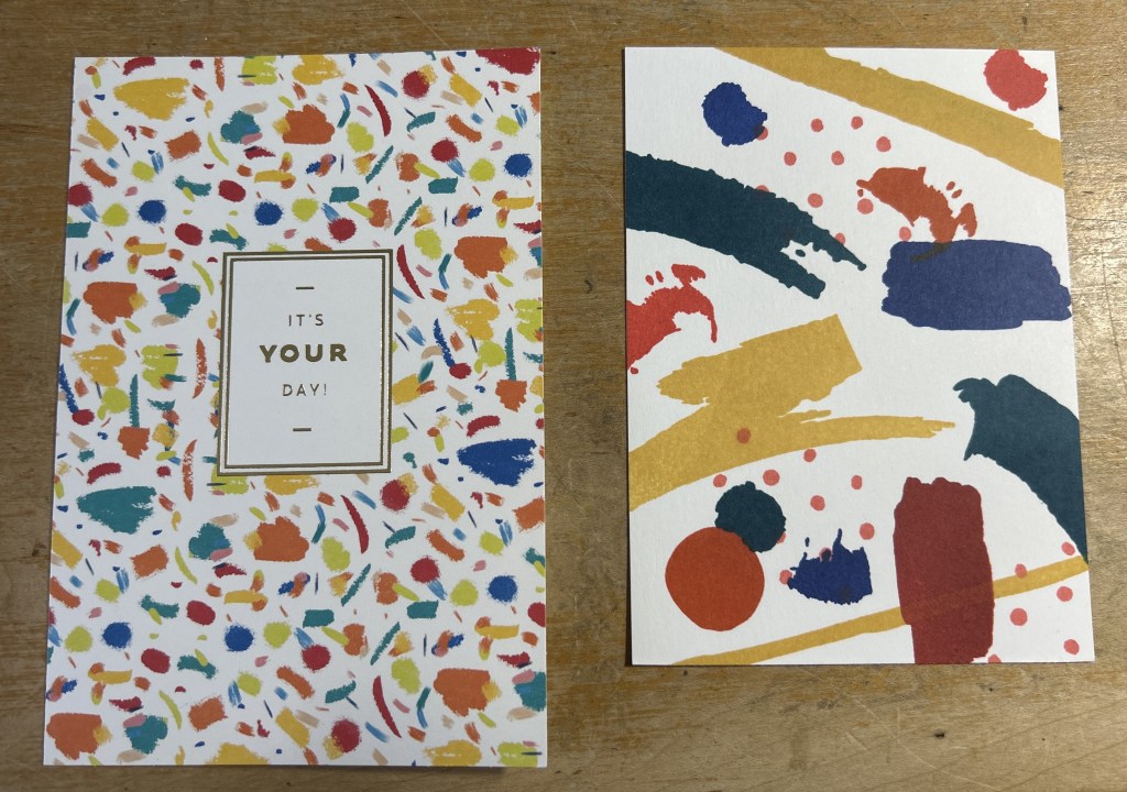
I received a birthday card from my aunt this year that immediately caught my eye. It featured a joyful watercolor background filled with playful brushstrokes in mustard, teal, navy, and red. The color story felt energetic but cohesive, and I knew I wanted to explore that palette in my own way.

Rather than copying the card directly, I treated it as a starting point and asked: What do I love most about this? The answer was clear — the bold, painterly shapes and the modern color combination.

Building the Background

To recreate that abstract watercolor feel, I pulled out:

  • Papertrey Ink – Watercolor Wonder
  • Concord & 9th – Playful Patterns

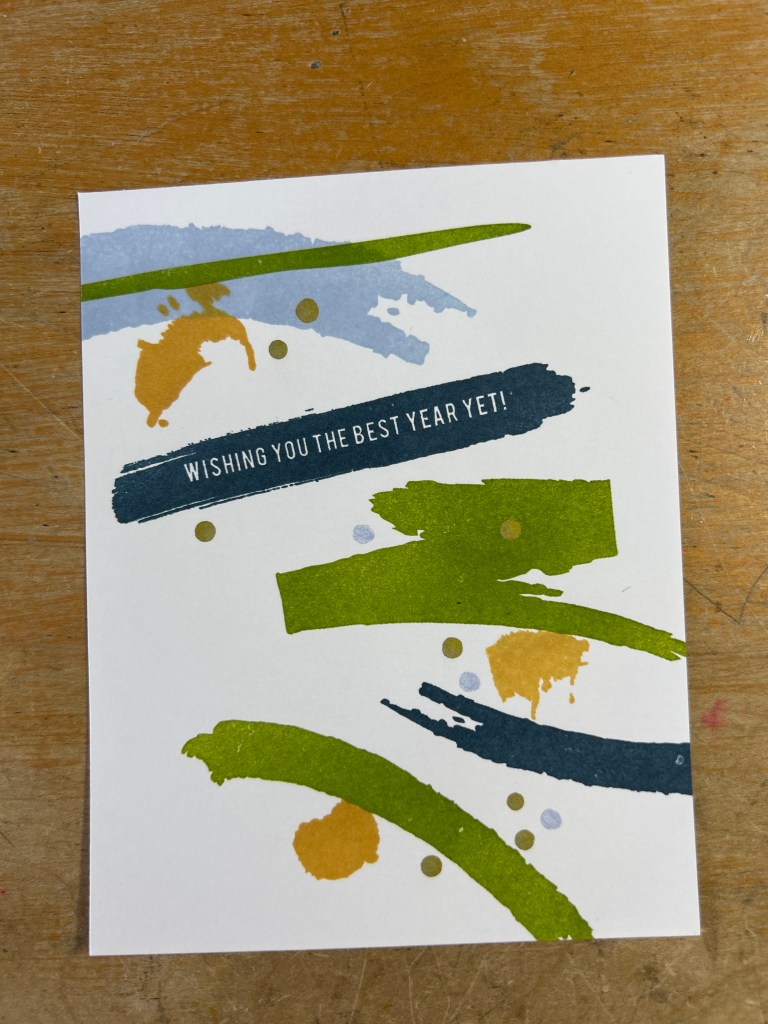
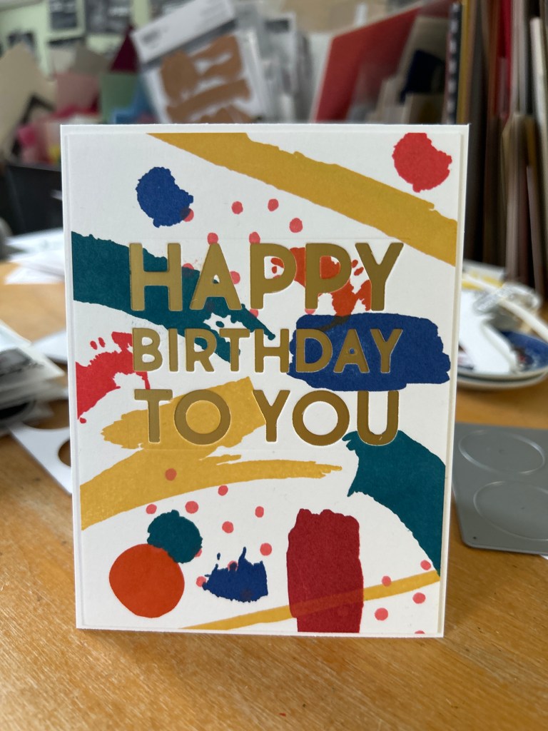
I combined larger brushstroke images with smaller dots and organic shapes, working in layers. The key was keeping the color palette tight: mustard yellow, deep teal, navy, and a warm red/coral.

Instead of trying to “balance” every mark, I let the shapes overlap naturally. The background is busy, but the white space allows it to breathe.

Choosing the Sentiment

With a bold background, the sentiment needed to be strong enough to stand up to it.

I used the Sizzix Tim Holtz Thinlits Bold Text (665847) die set and cut “HAPPY BIRTHDAY TO YOU” directly from the finished panel. Rather than layering a sentiment on top, I wanted the words to become part of the design.

Behind the cut panel, I added a layer of matte gold cardstock to carry the cold foil from the original card. Originally, I tested mirror gold. It was fun and flashy, but it overpowered the painterly background. The matte gold, however, softened the look and felt more integrated. It added richness without competing with the watercolor texture.

Inlaying the small inner letter pieces kept the design sleek and flush, which helps maintain a clean, modern feel.

Casing a card doesn’t mean recreating it exactly. It means identifying what speaks to you and translating that element through your own supplies and style.

This project reminded me how powerful a strong color palette can be — and how a small material choice, like switching from mirror to matte gold, can completely change the final look.

I had so much fun, I kept going!