The Papertrey Ink Garden of Life set has been sitting in my stash for years.
I am fairly certain I bought it secondhand. Probably Facebook. Maybe eBay. Five years ago? That sounds about right.
I remember trying to use it once. I made something, did not quite know where to go with it, and quietly put it away.
Today, I pulled it back out.
I had been watching a YouTube video by Prairie Paper & Ink, and she was watercoloring florals from a new Simon Says Stamp set and her colors were inspriring. That sent me digging through my own stash to see if I had anything with some similar shapes.
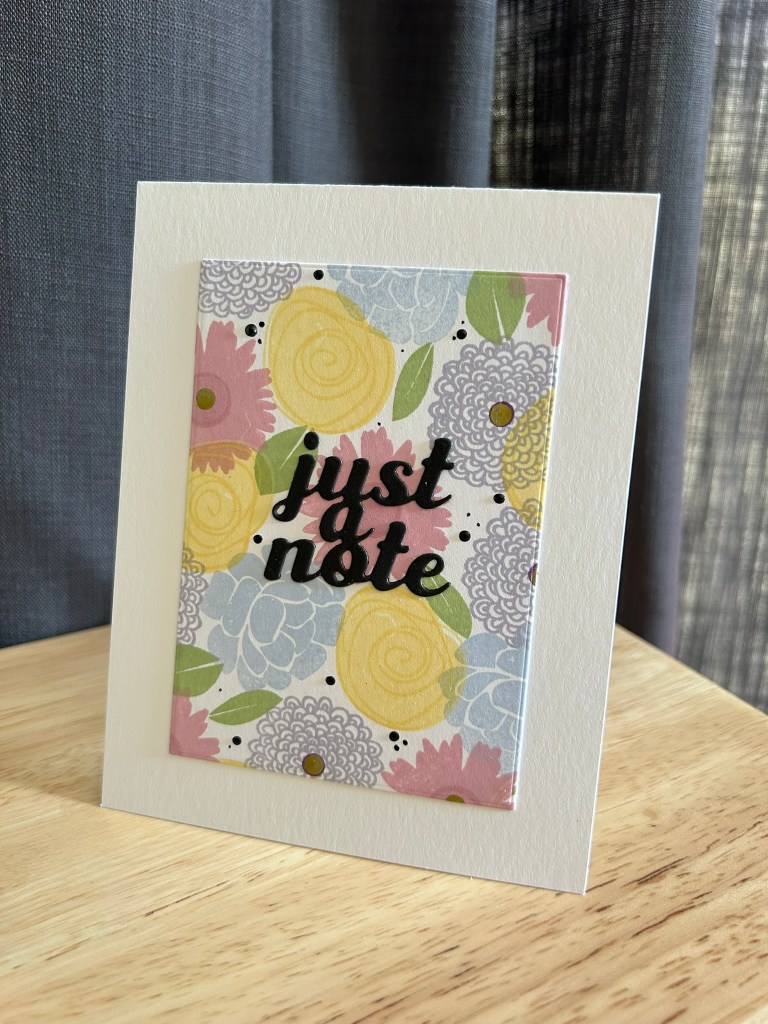
It was that mum in Garden of Life that caught my eye. The first card leaned into pattern and layering. I let the flowers fill the space and added a bold die cut sentiment. It felt cheerful and generous.
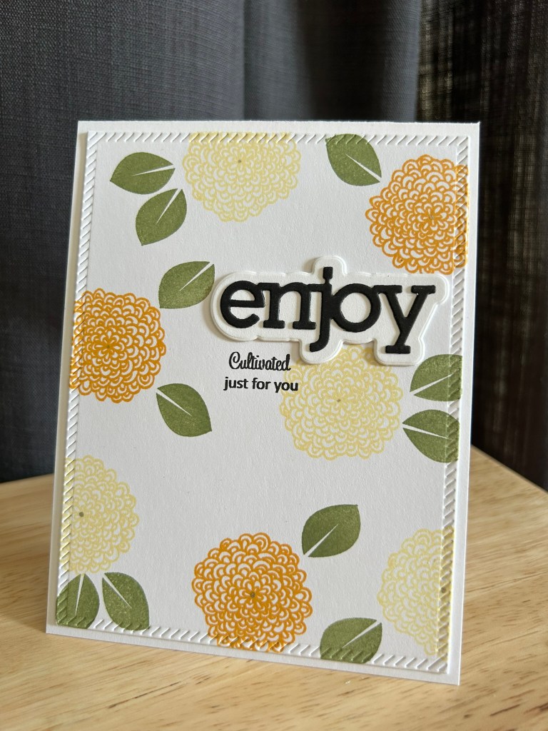
Once I started looking more closely at the set, I went down a little rabbit hole and found an old video of Nicole Heady from Papertrey Ink. She had stamped one of the florals on fabric and sewn it into a bag. Seeing it used that way shifted something for me. It reminded me that this set was designed thoughtfully.
From there, the cards began to evolve.
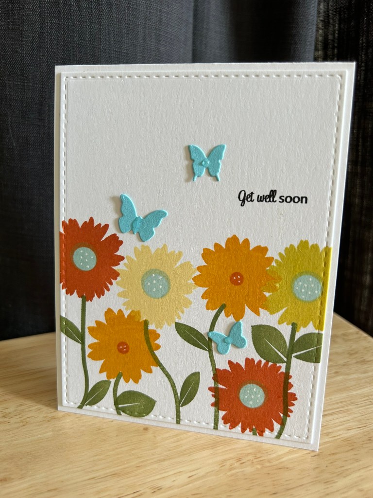
I focused on the fuller florals and created a more joyful get well card with layered blooms and butterflies. Same set. Completely different mood. At some point I consulted Chat GPT regarding what color to use on the flower centers to help it feel more spring like- the answer aqua. Brilliant.
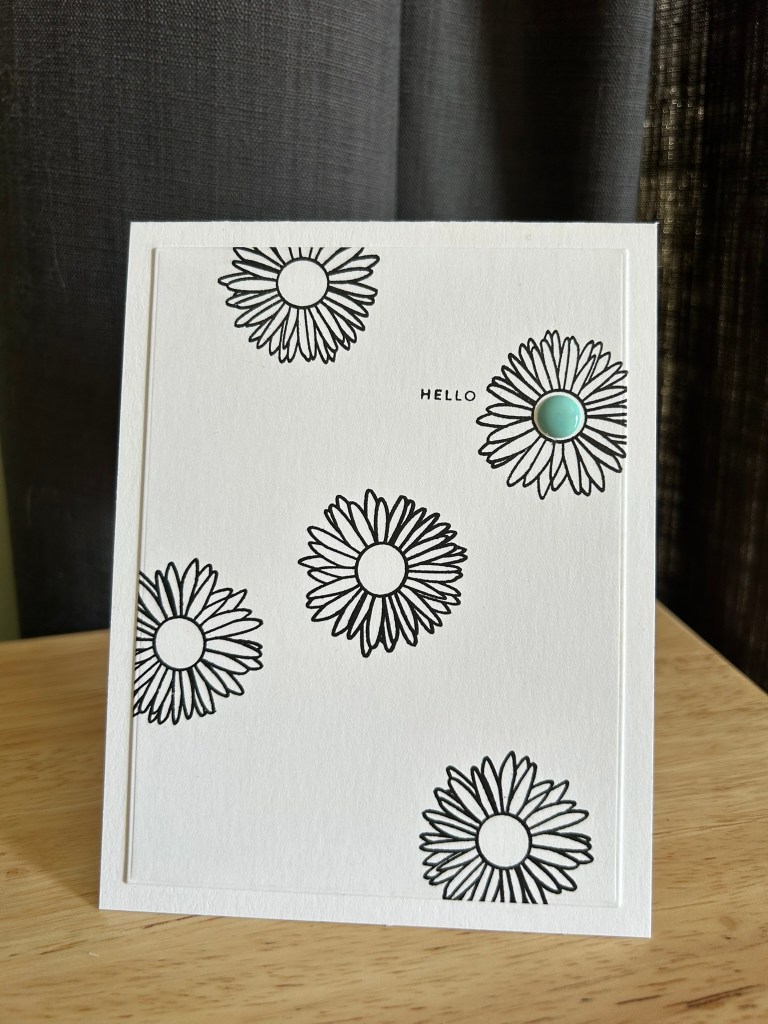
Then I tried something completely different.
I stamped the graphic outline flowers in black on white and left a lot of breathing room. One small aqua center dot became the only pop of color. Suddenly the set felt modern. Crisp. Intentional.
That little aqua accent started to show up again and again. It became the thread tying the cards together.
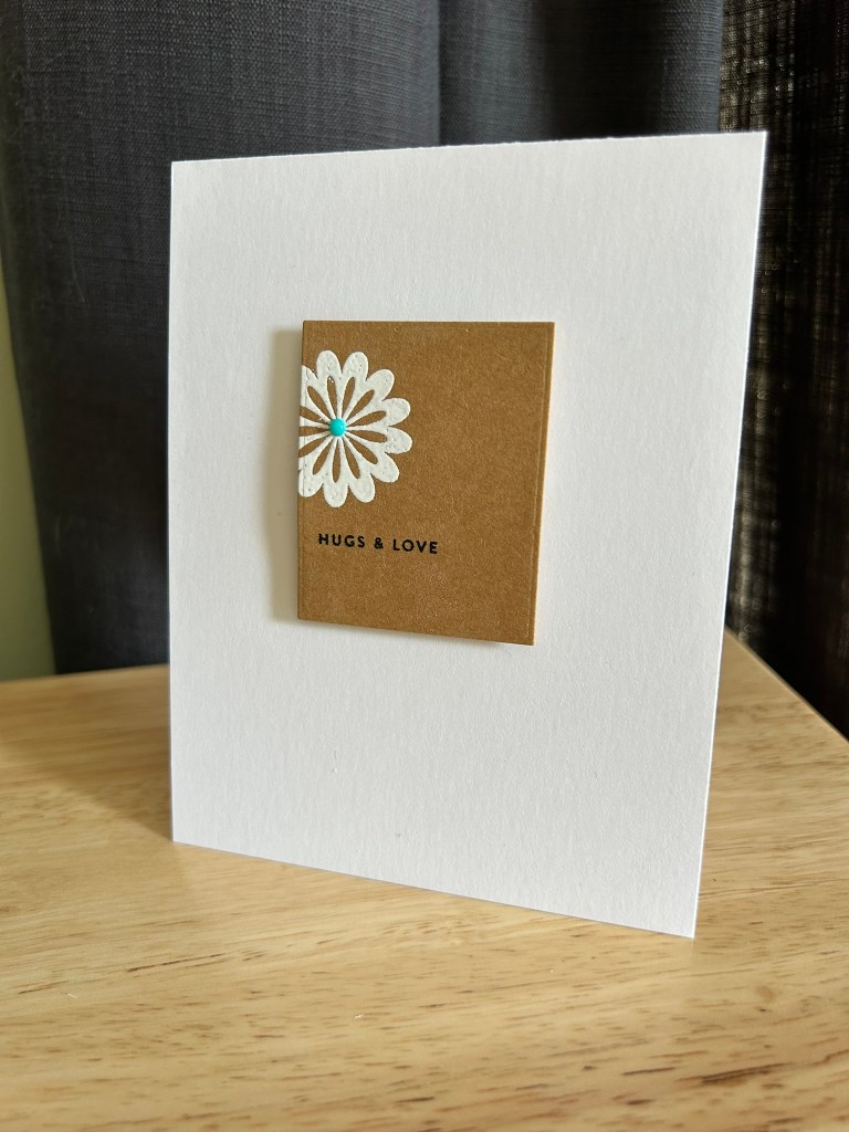
Next, I played with white embossing on kraft using one of the more open graphic flowers. Cropped into a smaller square and mounted on a white base, it felt like a tiny art print. Clean. Graphic. Contemporary.
I used to think this set felt a little old fashioned.
Now I see that it was simply waiting for me to catch up.
The stamps were always well designed. They stood the test of time.
What evolved was my eye — my sense of balance, my comfort with restraint, my willingness to let white space do the work.
Sometimes rediscovery isn’t about the supply.
It’s about the maker.
