This week I pulled out Flower Garden, an early Papertrey Ink stamp set. In my Evernote inventory, I had noted that I hadn’t used it very much, which is usually a sign that a set might be headed toward the donation pile.
When Flower Garden was first released, the sample cards leaned heavily into repeating patterns and fuller backgrounds. The designs were cheerful and decorative, with lots of layered elements and sentiment labels.
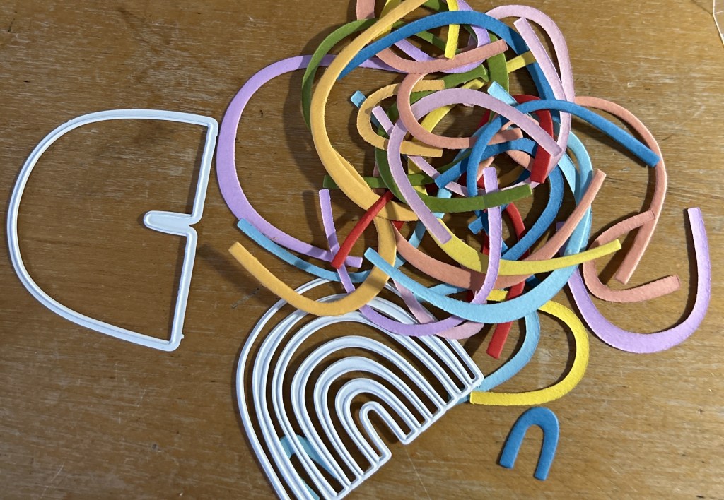
Instead of trying to recreate that original style, I simply started experimenting.
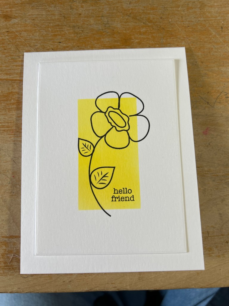
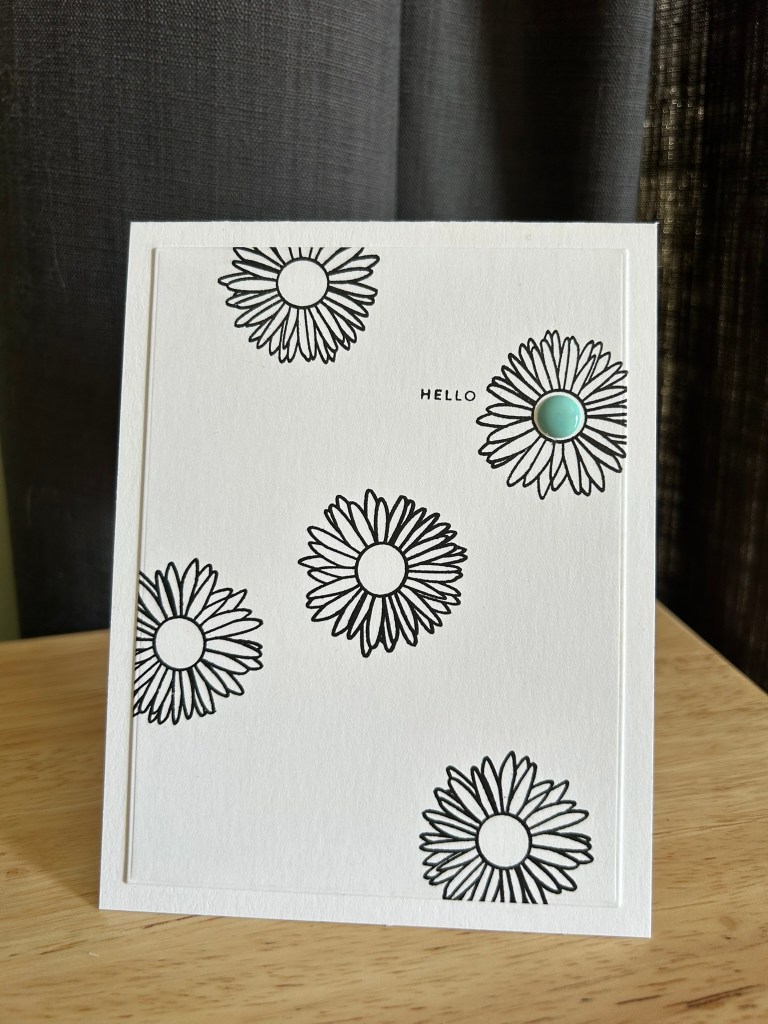
For the first card, I masked off a section of the card and blended a bright yellow. Then I stamped the flower outline across the panel to create a simple black pattern.
Keeping the rest of the panel mostly black and white helped that single flower become the focal point. A small sentiment strip finished the design without competing with the pattern.
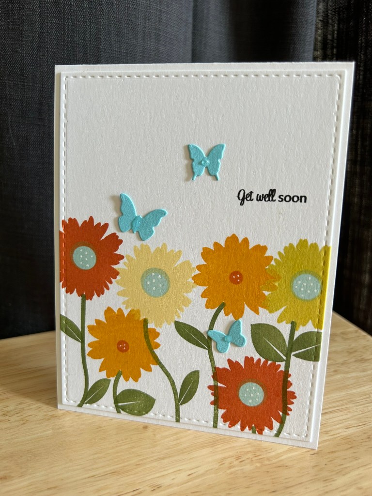
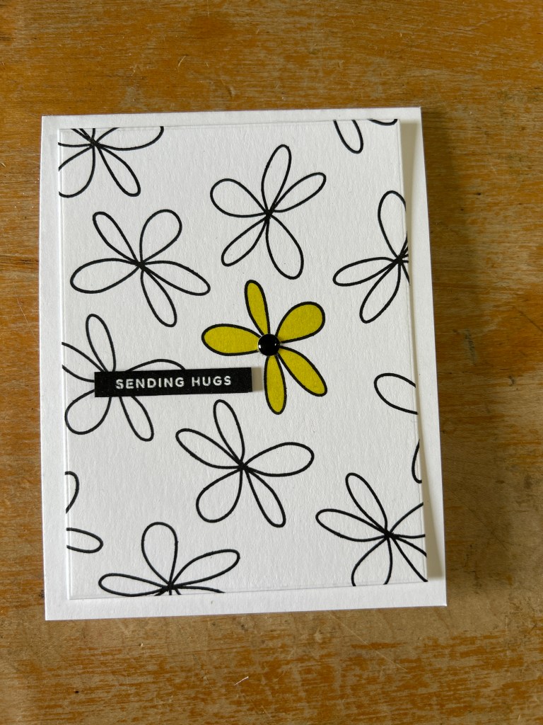
Keeping the graphic vibe going, I stamped a single flower to create a background. The design relies on white space and a limited palette rather than a busy pattern.
This approach gave the stamp set a surprisingly modern look and showed how well the line art works when it has room to breathe.
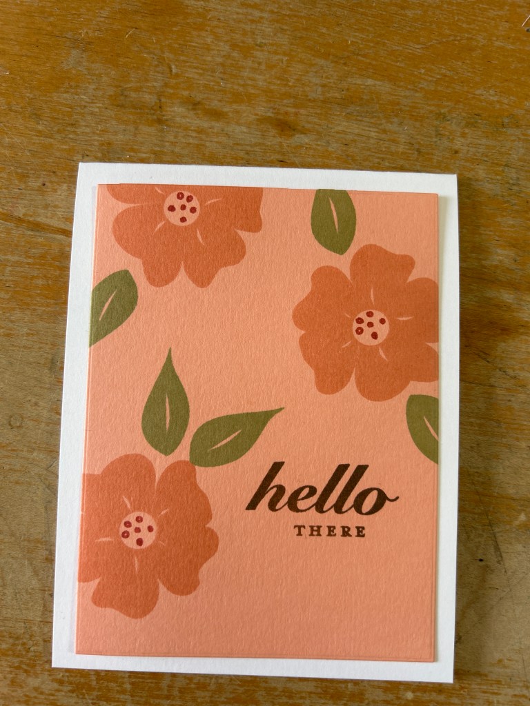
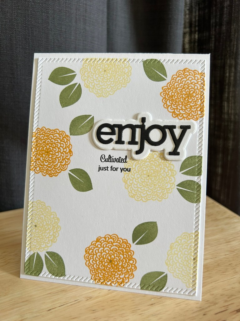
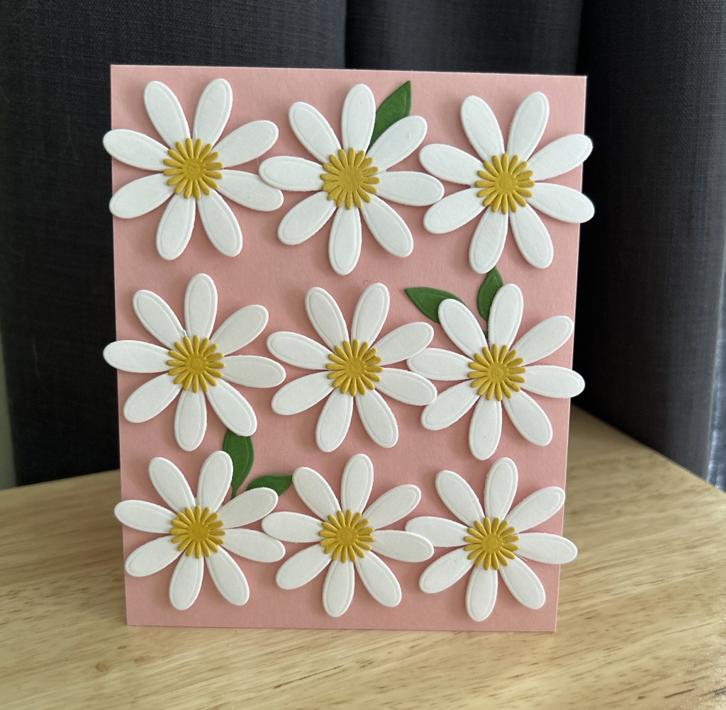
For the third card, I returned to a repeating pattern, but with a softer palette and simpler composition.
Using peach tones with olive leaves created a vintage textile feel.
This card felt like a bridge between the original style of the set and the simpler designs I tend to gravitate toward now.
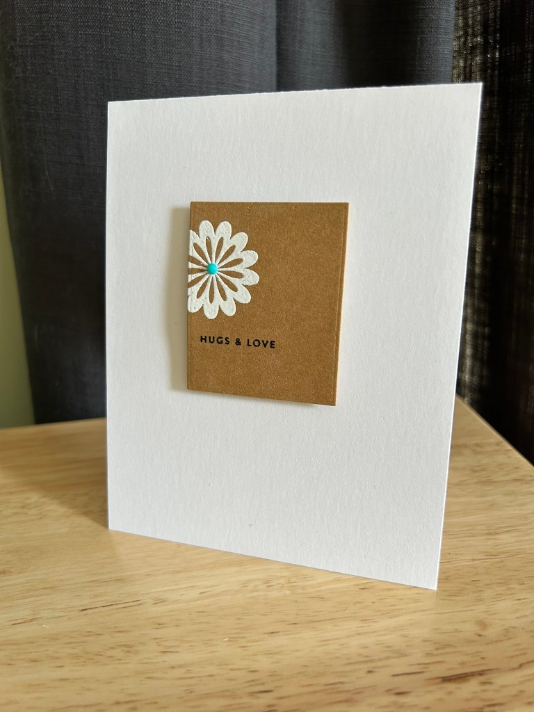
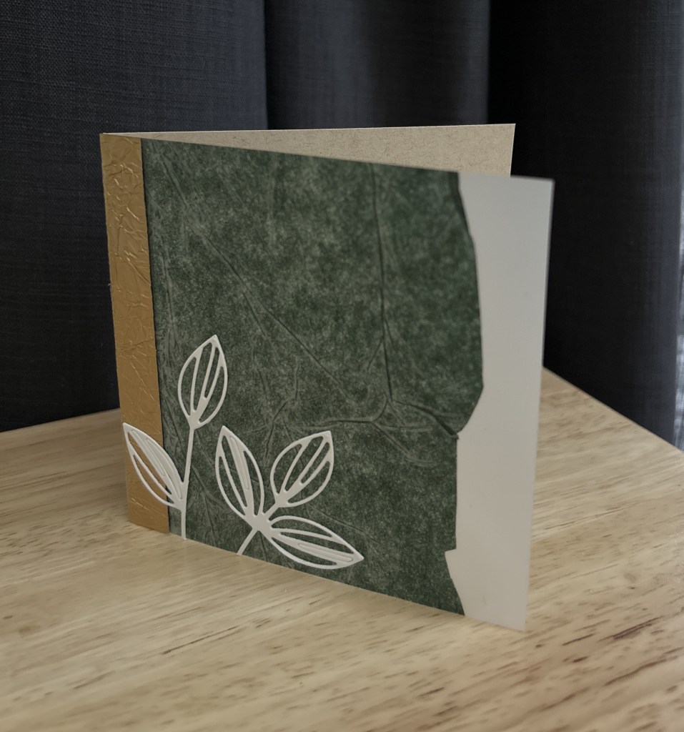
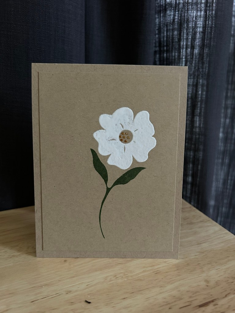
The final card is the quietest of the group.
A single white flower heat embossed (twice) on kraft cardstock, paired with deep green leaves and tiny gold glittery drops in the center, lets the design stand on its own. I chose to leave the front sentiment-free so the flower could remain the focal point.
In fact, a friend saw the card sitting on my desk and immediately picked it out to send. That’s usually a good sign that a design is working.
Final Thoughts
Working with Flower Garden again reminded me that good design is simply good design.
The stamps themselves didn’t change. What changed was how I approached them.
When I first bought this set years ago, I probably felt like I needed to use every element and fill the entire card front with pattern. That was the style I saw in the original samples, and it’s easy to assume that’s the way a set is meant to be used.
But revisiting the set showed me something different.
The same images can create bold graphic patterns, soft calico-style florals, modern minimal designs, or a single simple botanical. Once I stopped trying to use the set the way I originally saw it, it revealed far more flexibility than I had given it credit for.
Sometimes an older stamp set doesn’t need to be replaced. It just needs to be seen again with fresh eyes.